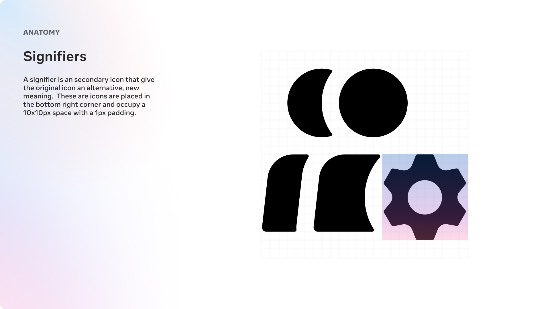
Meta VR Iconography System
Overview
I was brought onto the Reality Labs Design System team to refresh and unify the icon language across the Reality Labs ecosystem. The work centered on creating a scalable visual language that could bridge product UI, system patterns, and future hardware experiences while still feeling distinctly Meta.
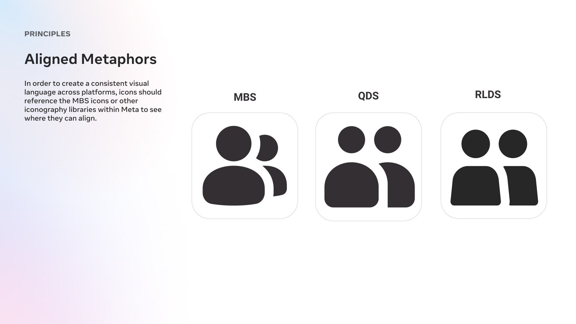
Over the course of the project, the system was shaped through iterative exploration, principle-setting, and alignment across adjacent Meta libraries so the foundation could hold up as the platform evolved.
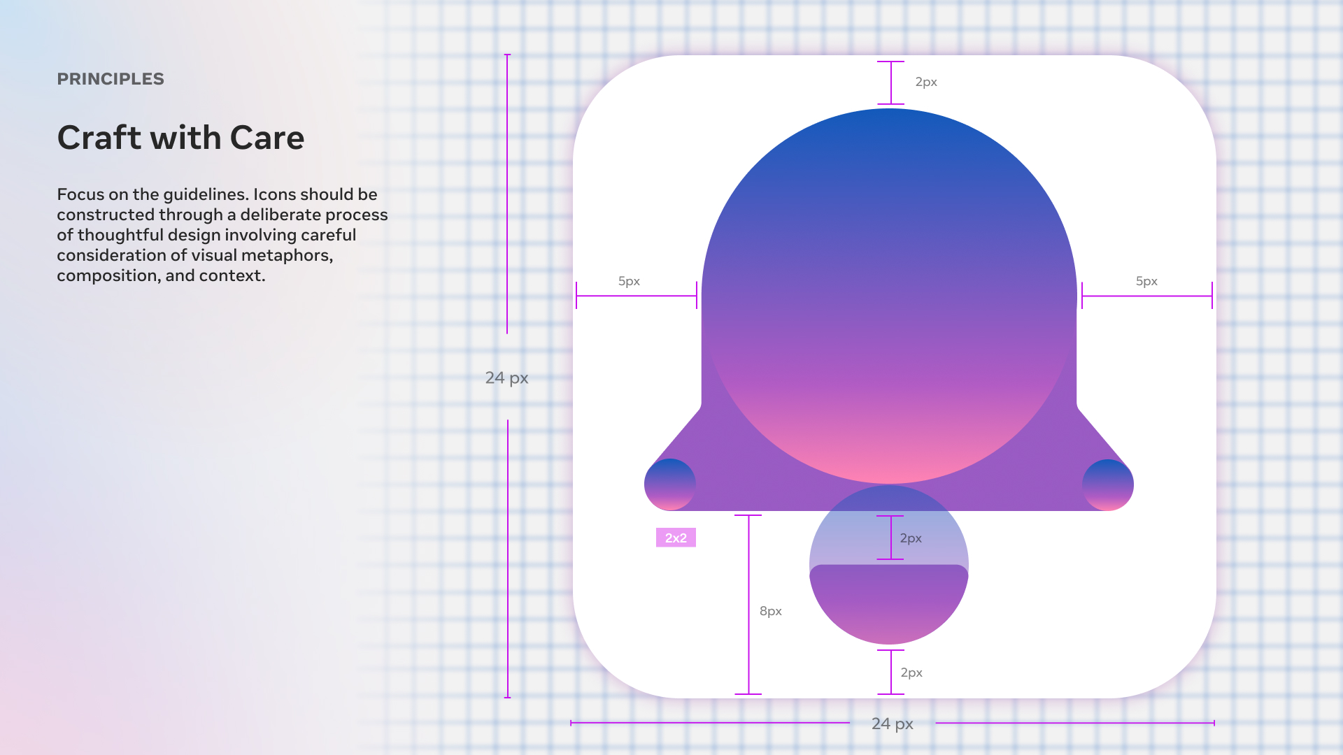
Exploration
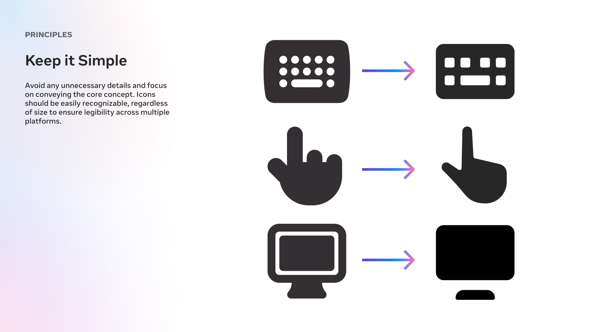
The initial phase focused on defining core principles for the new icon system. We audited the existing sets, looked broadly at current iconography trends, and tested opportunities for clarity, flexibility, and consistency across Reality Labs surfaces.
Through reference gathering, iterative design, and broad working sessions, the goal was to establish a durable visual direction that felt simple, intentional, and ready to scale into a more complete library.
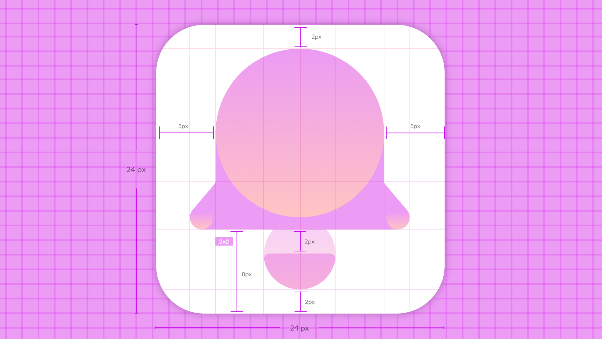
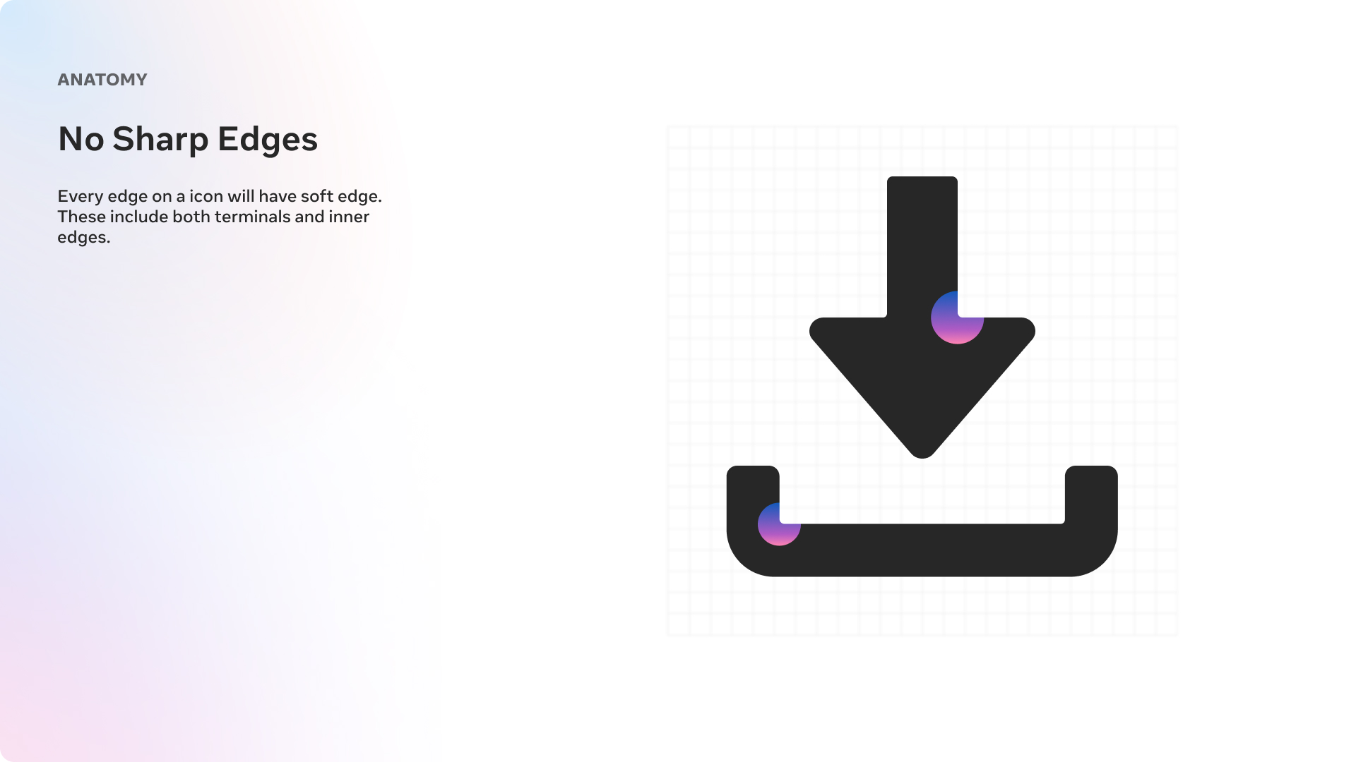
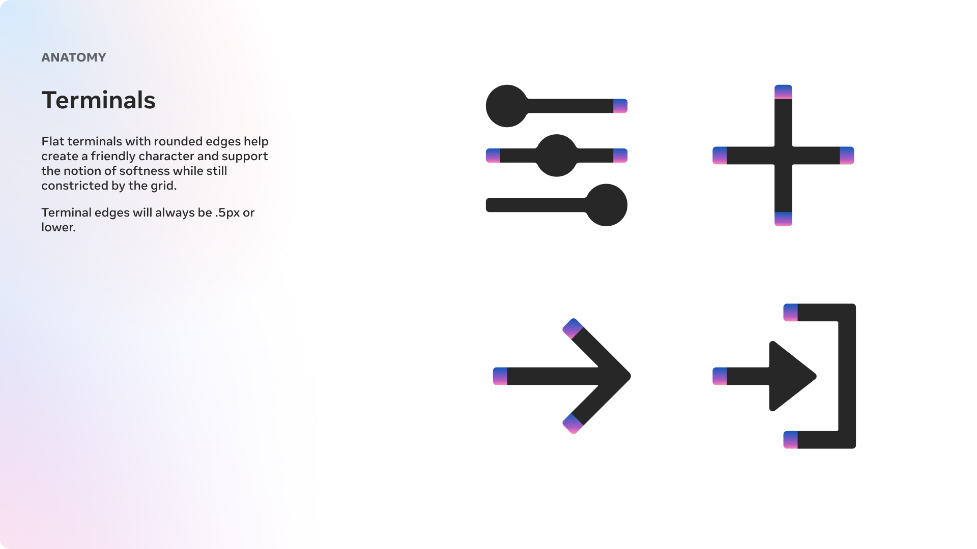
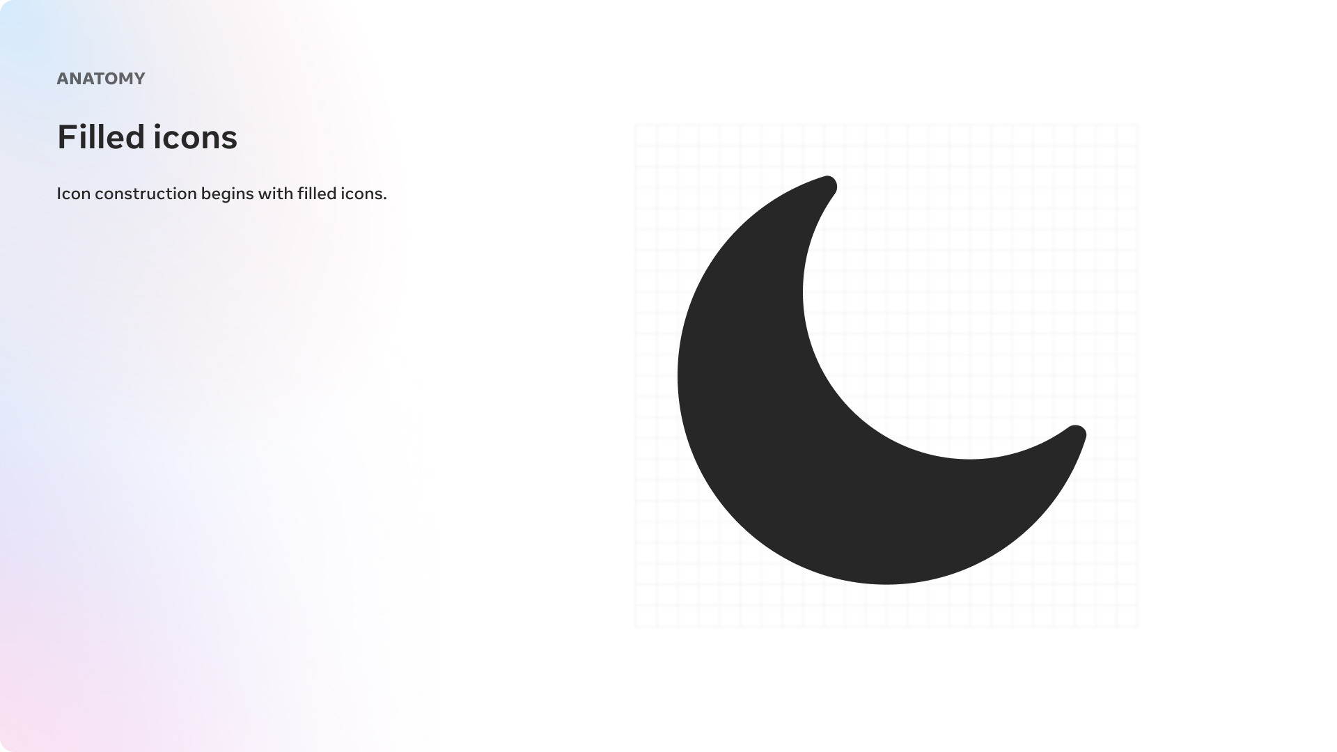
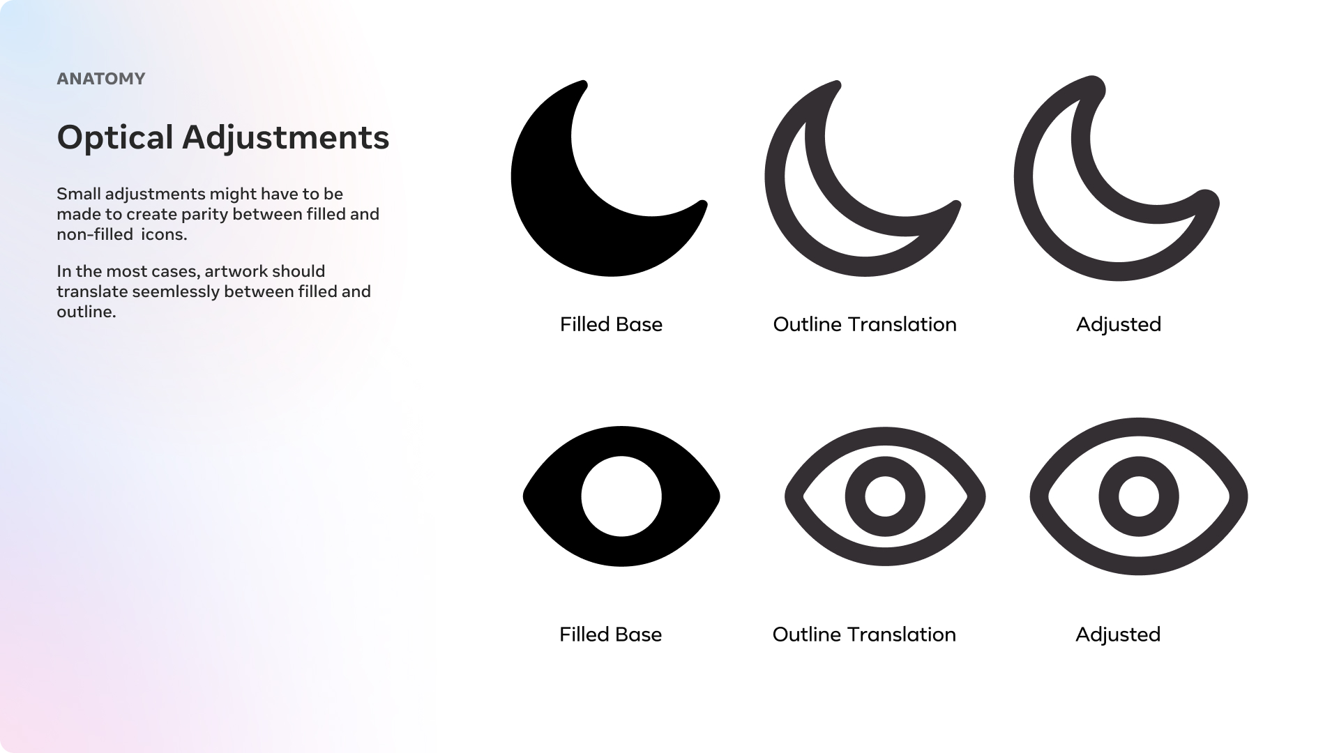
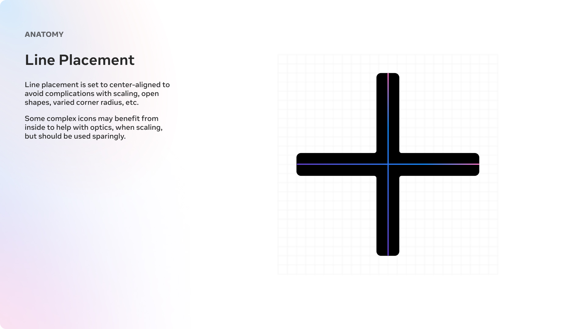
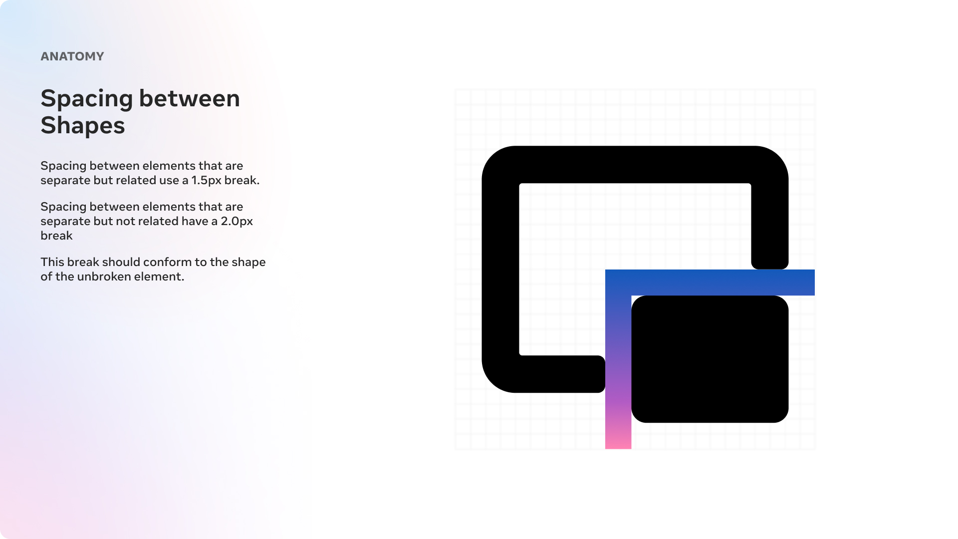
Construction
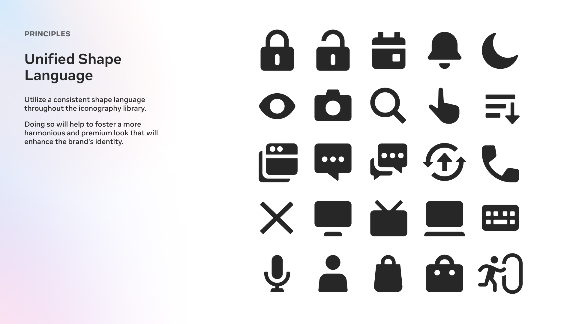
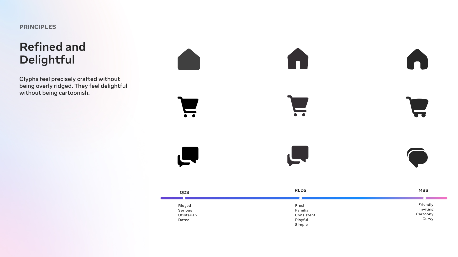
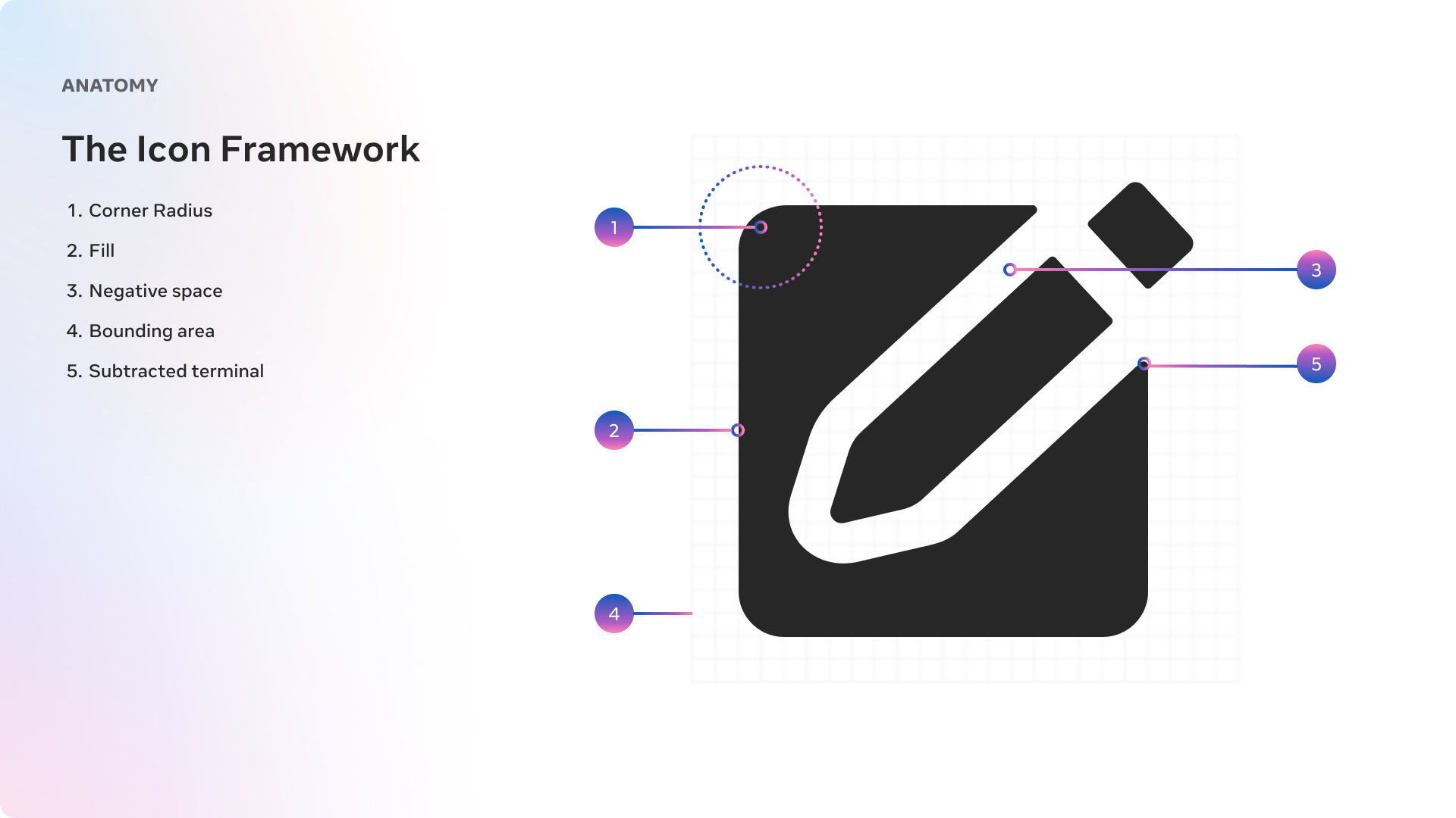
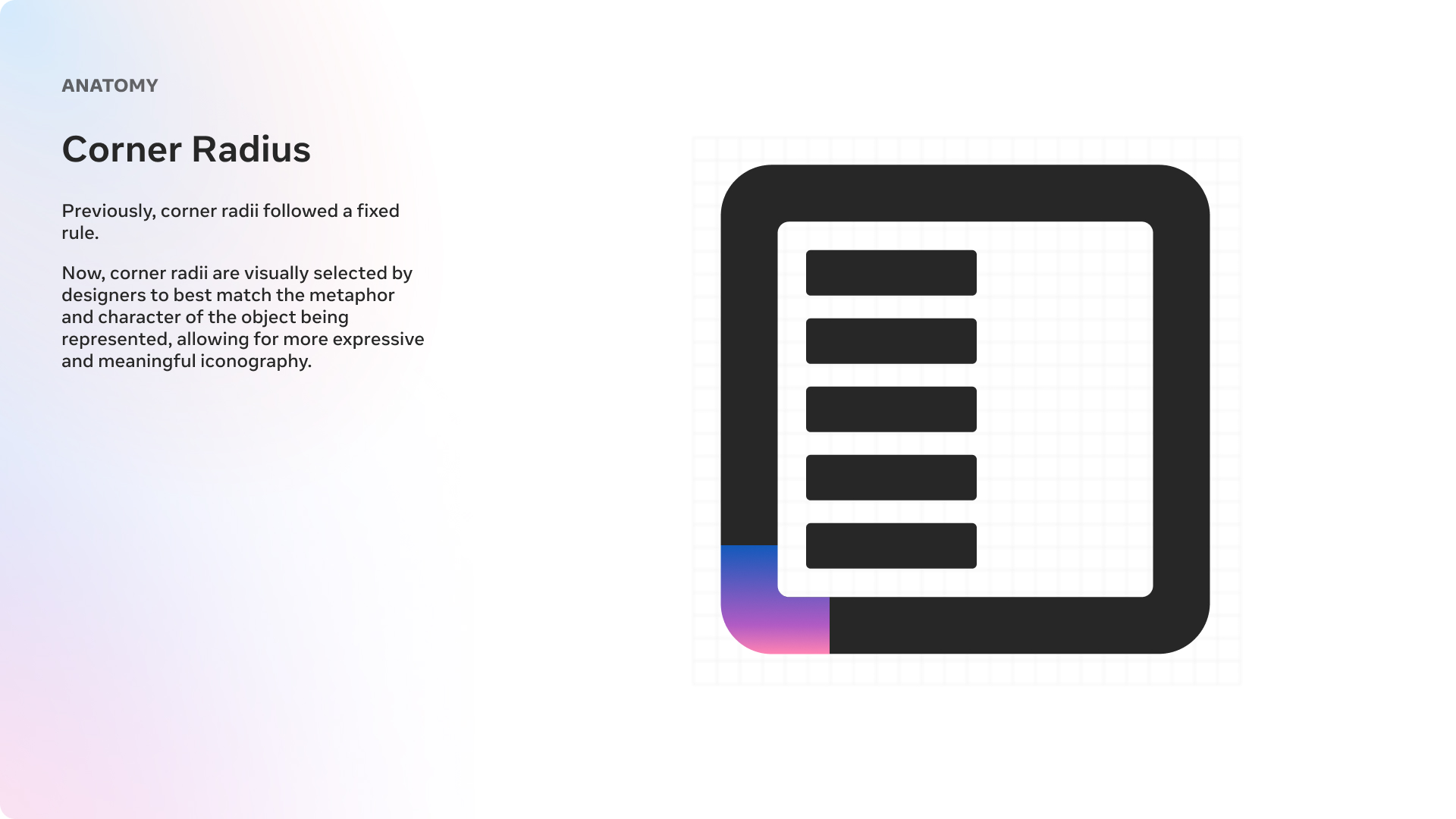
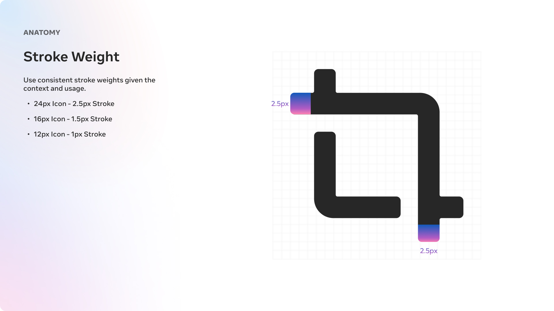
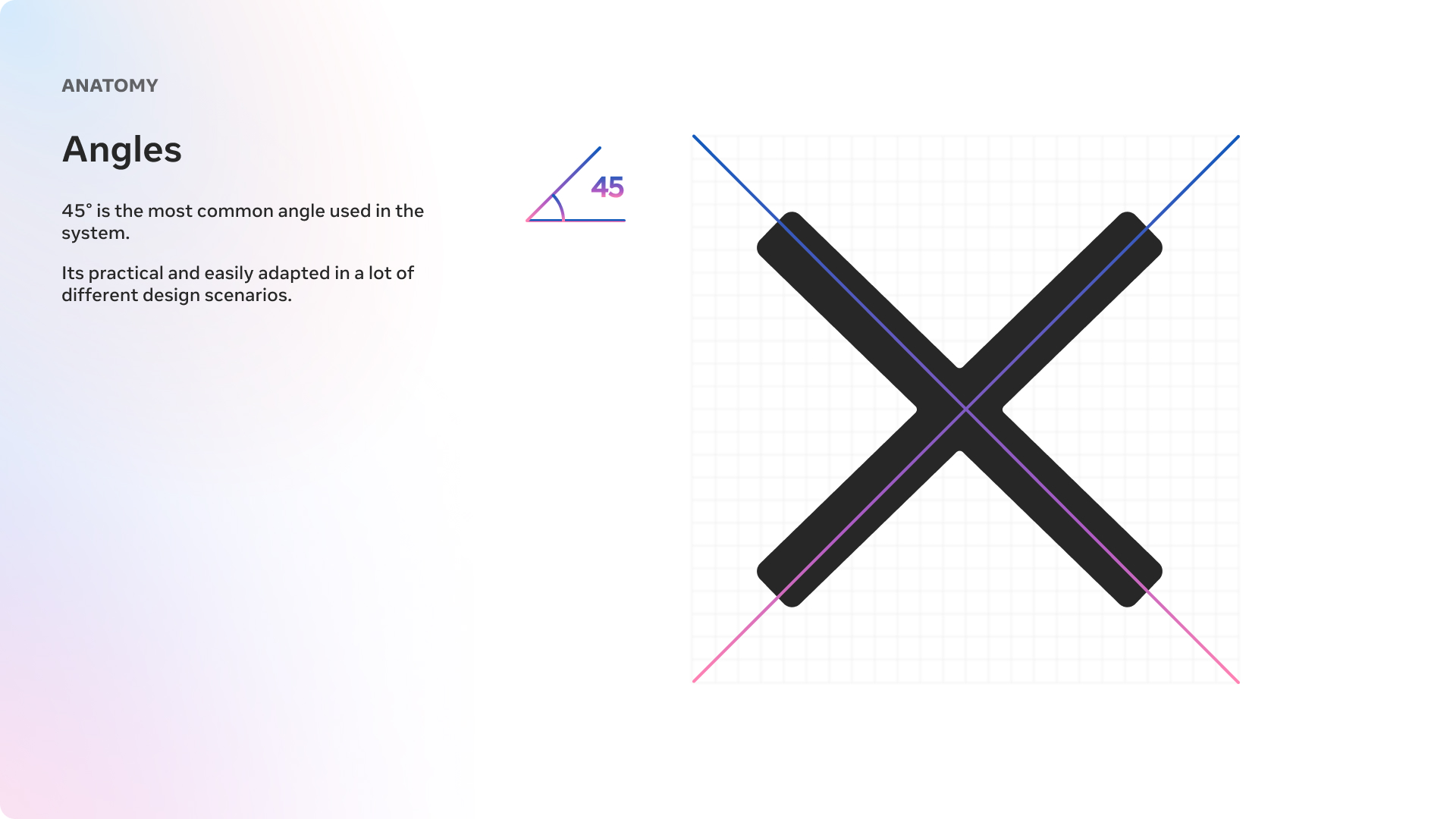
Once the principles were defined, the system moved into construction. Each glyph was shaped around a shared geometry and a more unified silhouette language so the library could feel cohesive at both the single-icon level and at system scale.
That structure made it easier to refine edge cases, improve legibility across sizes, and give the library a more premium, consistent feel as it expanded into broader platform use.
Outcome
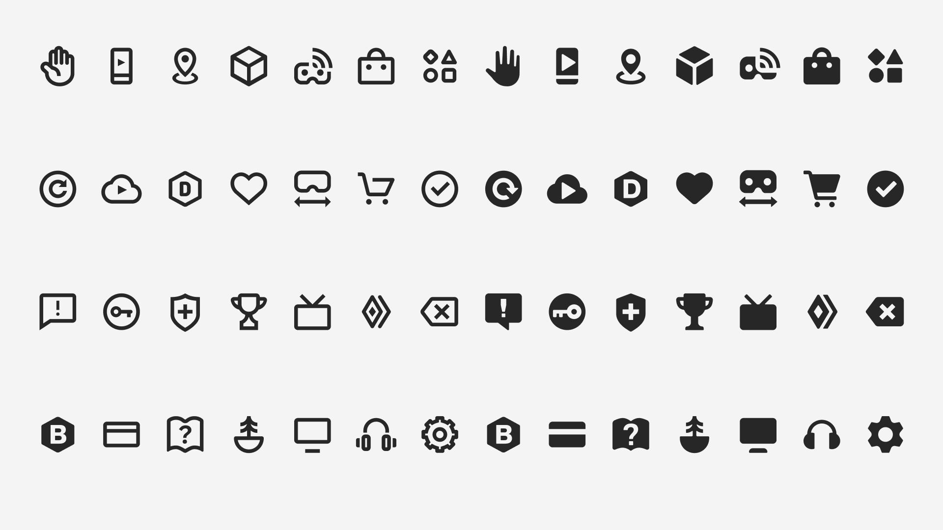
Once I received the green light from design leadership, I moved into full production and delivered over 800 icons within a three-month span earlier this year. With the system's visual principles and construction guidelines already well established, scaling up the icon set became a streamlined effort.
Each asset was meticulously crafted to align with the design language we had defined, maintaining consistency in stroke, proportion, and overall visual rhythm across the entire library. Once finalized, every icon was prepped and exported for engineering implementation. This included production-ready cuts tailored for various use cases and environments across our platform.
Following delivery, we entered a testing phase where the icons were integrated into product builds and evaluated in context. We're currently working closely with product designers to gather detailed feedback, refine as needed, and ensure the icons meet the functional and aesthetic standards expected at Meta. Our aim is to complete final adjustments and push for release by September.